Following our improvement of their website’s SEO, the client approached us to help improve their website in order to drive more conversions and ensure that the new influx of traffic wasn’t going to waste.
We came up with longterm plan to improve their website’s SEO and paid ads.
Objectives
Drive more conversions through the website with clear CTA's.
Simplify the design of the website to reduce confusion.
Improve the look, feel, and overall usability of the website while preserving our hard-won SEO gains.
Our plan and execution
Now that they were receiving more traffic from organic search results and paid ads, the client wanted to ensure that it wasn’t going to waste.
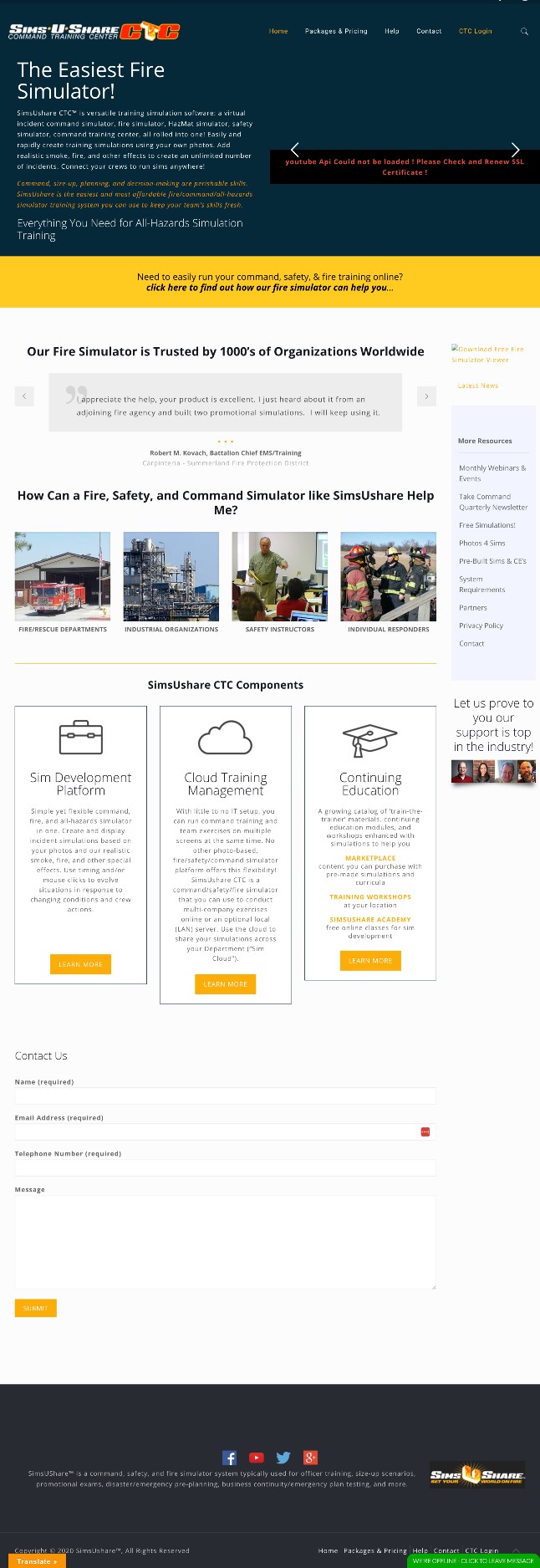
Their website design was outdated and downright confusing at times, with 14 different contact forms scattered throughout different areas of the site. The website also lacked a singular, clear call to action (CTA) to compel their visitors to take action.
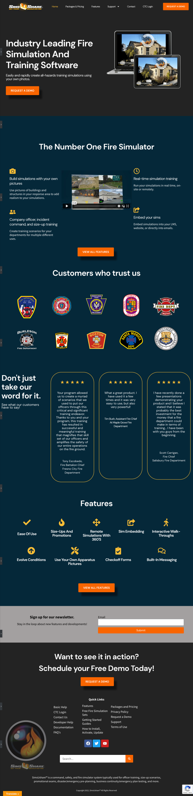
Through four months of redesign, we came up with a plan to simplify the website to highlight the product’s numerous benefits, while including one clear call to action on every single page so visitors knew exactly what we wanted them to do––schedule a product demo.
Homepage before
Homepage after
The results
Web sales increased by 5x in the two months after the new website launch.
The website’s bounce rate––the percentage of visitors to a particular website who navigate away from the site after viewing only one page––decreased by 96.74%.
The client receives an average of 3 to 5 qualified product demo requests through the website per day since the new website launch.
Want results like this?
As experts in website design and development, we understand the importance of creating a website that is not only functional but also visually appealing to visitors. When visitors come to your website, they should be impressed by its design, ease of use, and the overall user experience. Our team has the skills and experience necessary to create a website that will not only attract visitors but also keep them engaged.